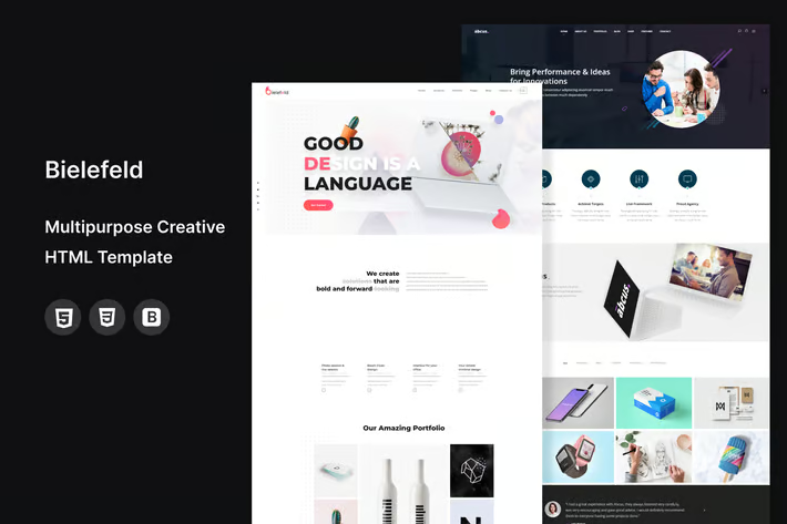
Why Your Creative Agency's Website Probably Sucks (But It Doesn’t Have to)

Okay, let’s dive straight into the heart of cyberspace—creative agency websites. I've seen my fair share, and let's just say, not all are created equal. Some are like a Jackson Pollock painting—visually stunning but a bit overwhelming. Others? More like a clear night sky: dark, sleek, and simply beautiful with their dark mode aesthetics.
Through the Lens of a Tech-Enthusiast and Entrepreneur
First off, let’s talk digital marketing integration. If your agency’s site isn’t seamlessly integrating this by now, you’re basically driving a Model T in the Tesla era. Mobile app integration? Non-negotiable. I mean, if I can run half my life from an app, why wouldn’t I expect the same from the brands I interact with?
And don’t get me started on dark mode design—it’s not just for the night owls; it’s a sleek, modern look that saves battery life and looks ridiculously cool. Let’s be honest, it makes reading at 3 AM a bit less guilt-inducing when you’re supposed to be catching Z’s.
Why Some Sites Just Get It
I've stumbled upon a few gems in the digital wasteland where creativity meets functionality. These sites capture the essence of the brand and make navigation a breeze. It’s like walking into a well-organized, beautifully decorated room—you just don’t want to leave.
Now, let’s talk about the less impressive bunch. Ever landed on a site and felt like you’ve time-traveled back to 1999? Yeah, me too. Clunky design, confusing navigation, and let’s not forget the dreaded 404 errors. It's like expecting a gourmet meal and getting served reheated leftovers.
Checklist for a Killer Creative Agency Website
- Intuitive navigation—no treasure maps needed.
- Mobile integration that’s smoother than my morning espresso.
- Dark mode options to keep it easy on the eyes.
- Content that’s as engaging as a top-tier novel.
- SEO that puts you on Google’s first page, not its last.
- Aesthetic visuals that pop but don’t overwhelm.
- Fast loading times because patience is so last century.
- Regular updates, because stale doesn’t sell.
- Client testimonials that aren’t cringeworthy.
- Clear calls-to-action—tell me what to do next!
It’s not rocket science, but you’d be surprised how many get it wrong. Get these right, and you're not just in the game—you're dominating it.
When Dark Mode Meets Mobile: A Love Story
I’ve got a thing for dark mode; it’s sleek, it’s chic, and it doesn’t feel like I’m staring into the sun. Pair that with killer mobile integration, and it’s like peanut butter meeting jelly—perfect harmony. Apps that let me toggle this on and off? Chef’s kiss!
But here’s where it gets spicy: not all mobile integrations are created equal. I've seen sites that look great on desktop but crumble like stale cookies on mobile. And in 2025, if your site can’t keep up with my smartphone, we’re going to have problems.
And the real kicker? When these elements align, they make or break the user experience. It’s not just about looking good—it’s about being good on every platform. In my experience, when I worked on enhancing the mobile responsiveness for my brand’s app, engagement skyrocketed. It’s clear—flexibility and accessibility drive user retention.Let's Wrap This Up!
So, what’s the take-home message here? Simple: Don’t make a website that sucks. Embrace digital marketing like it’s your soulmate. Dive into mobile app integration like it’s the deep end of the pool. And dark mode? Make it your website’s new best friend. Do these, and watch your creative agency lead, not follow.
Now, what do you think makes or breaks a creative agency’s website? Let’s get the comments rolling!


