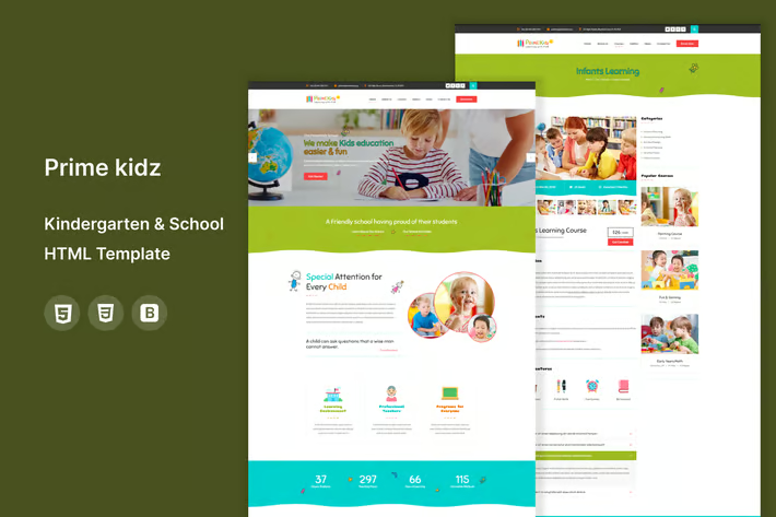
When Pixels Collide: The Art and Science of Crafting Web Designs That Stick

Hey there! Ever noticed how some websites make you feel like you’re on a virtual beach, sipping a mojito, while others feel like you're stuck in a 1990's dial-up nightmare? I've got a few secrets up my sleeve on how to avoid the latter. Strap in, it's going to be a wild ride through the world of web design.
Why Minimalism Isn't Just a Trend, It’s a Necessity
Alright, let’s kick things off with minimalist web design. Why am I a fan, you ask? Simple: it’s clean, it’s efficient, and it doesn’t try to sell me a sofa when I’m just looking to buy a lamp. Minimalism in web design is like that cool, calm friend who knows exactly how to soothe you when you’re feeling overwhelmed.
But don't just take my word for it. In my experience, users are four times more likely to engage with a website that doesn’t bombard them with unnecessary info. They want to find what they're looking for—fast. And hey, the quicker they find it, the quicker they're likely to hit that 'buy' button.
Plus, a minimalist approach isn't about having less; it's about having the right amount. It's about making everything count without making your visitor work for it.
The Big Players: How E-commerce Giants Are Crafting the Future
Speaking of hitting the 'buy' button, let’s talk e-commerce. This isn't just about having a shopping cart and a checkout button anymore. It's about creating an experience, something memorable that stands out in the endless sea of online storefronts.
And who’s doing it right, you ask? Well, without naming names—because my lawyer friends get twitchy—let’s just say the big players are those that create an intuitive user journey from homepage to checkout. They use bold visuals, streamlined interfaces, and smart analytics to guide their designs.
Travel and Tourism Websites: Your Virtual First-Class Ticket
Now, onto travel and tourism web design, which should feel like the first day of vacation. It's all about dazzling potential travelers with imagery and dreamy descriptions of their next escape. But here’s the kicker—it also needs to be super functional. No one wants to get lost looking for the best deals or coolest destinations.
I've seen the best success with sites that combine breathtaking visuals with incredible user experience. These sites make you feel like you're already on an adventure. And honestly, if a website can make me feel the sand between my toes before I’ve booked a ticket, it’s got my vote—and likely my credit card number.
Quick Tips
- Keep it clean: More white space, less clutter.
- Make it intuitive: If my tech-averse aunt can't navigate your site, it's too complicated.
- Opt for high-quality visuals: Blurry images are a big no-go.
- Analytics are your best friend: Understand your visitors and tailor the experience.
Remember, every pixel counts when you're trying to impress and engage visitors. It’s like setting up a billboard on the internet highway—you want to be sure it’s eye-catching and makes people want to stop by, not just drive on by.
And here’s the twist: while everyone’s zigging with their flashy animations, the best approach might just be to zag with simplicity and elegance.So, have you ever landed on a website and just clicked around for the fun of it, not because you were looking for something specific, but because the design itself was an experience? Let me know!
What’s the most engaging website you've visited recently, and what made it stand out?


